At the Mobile Multimedia Lab of the Athens University of Economics and Business, we have been working on optimisations for the InterPlanetary File System distributed hash table (IPFS DHT) and, in particular, on Multi-Level DHT support. As part of this work, we wanted to better understand the process of discovering and fetching content through the libp2p-kad DHT. With that in mind, we have developed a visualization tool for the discovery process of a Content Identifier (CID).
The tool provides all the detailed information we need for debugging and for designing optimization techniques to speed up the content discovery process through IPFS’s DHT. We believe this visualization tool will be useful to other researchers and developers, so in this blogpost we share further details on the output of the tool, how to use it, and how it works in the background.
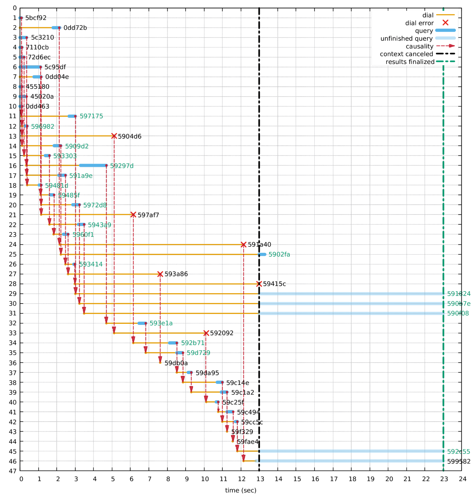
Visualization outcome: sequence of events during query process
How does it work?
You can find the tool in this repository, which includes all the necessary scripts and a step-by-step guide on how to use it. Here’s how it works.
The tool assumes that you installed the IPFS daemon and that you used it to perform a DHT query to some CID. This makes it convenient to look for content of interest to your application or to query arbitrary CIDs. You are required to pass the -v (verbose) flag to IPFS’s DHT query command-line tool so that you get as much information back from the query process as possible, which is stored in a file. That’s where the visualization tool kicks in, parsing the logs of the query. This is done through a python script, which comprises the main logic of the visualization tool. Finally, the graph is visualized through gnuplot, which gives us a plot similar to the one above.
A walk through the plot
The horizontal axis shows the seconds elapsed since the beginning of the query. The vertical axis lists the nodes contacted during the query execution, each horizontal line corresponding to a distinct node. Nodes appear, from top to bottom, in the order they were contacted. As expected, the first 10 nodes are contacted simultaneously at time 0, confirming Kademlia’s operation of sending the query to A(=10) nodes in parallel. In the example, we can also see that a total of 46 nodes were contacted by the querying node.
Yellow lines correspond to the process of dialing a node, i.e., establishing a connection to it. Some of these connection attempts fail (red crosses), while successful ones lead to querying the respective nodes (indicated by blue lines). A blue line provides a visual representation of a node’s query phase, spanning from the moment a query was sent to that node till the respective answer came back. Queries that timeout before an answer has been received are drawn in a pale shade of blue.
Vertical red arrows show causality relations, that is, they indicate which event of a previously contacted node triggered the dialing of another node. Typically, it is the response coming back from a node that triggers the communication to yet another node, as these responses suggest other nodes to contact closer to the target CID.
To the right of each line we can see the respective node’s Kademlia ID. Notice that this is derived from the CID by hashing its multihash representation. We only print the first six hex digits of the Kademlia ID, which are usually enough to differentiate between any two nodes. The Kademlia IDs printed in green refer to the nodes that the query identified as the K=20 closest ones to the target, i.e., they constitute the query’s findings. The remaining Kademlia IDs are printed in black.
The black vertical dashed line represents the “context canceled” milestone, which in our example happens at the 13-second mark. This is triggered by the end of the communication to a node, either because that node’s response has been received or because the attempt to dial a node failed—as is the case for node #28 with Kademlia ID 0x59415c. This moment signals the end of any ongoing dialing sessions and the start of the final queries to a few remaining nodes.
Finally, the green dashed line at the 23-second mark denotes the end of the entire query. In most cases, the querying command-line tool completes its execution when some internal timeout expires, rendering any pending node queries (drawn in a pale shade of blue) incomplete. In our example, this was a timeout of 10 seconds from the beginning of the queries to nodes #29, #30, #31, #45, and #46, starting at the 13th second and expiring at the 23rd.
Ideas for improvement
This visualization tool allows for an intuitive look at the evolution of queries over time. We harnessed all the information made available by IPFS’s command-line DHT query tool to make our visualization as accurate and information-rich as possible. However, there’s a bit of information that is not output by the command-line tool, namely the successful completion of a dialing session to a node. That is, although the logs report the moment dialing starts as well as the moment that it fails (if it does), they do not report its (successful) completion.
Feel free to open issues in the repository or to submit PRs to improve it!